

I conducted interviews and created short biographies to understand the users and their needs. Through this process, a primary user group emerged—single working adults seeking opportunities to socialize and make the most of their limited free time. Notably, this user group confirmed existing assumptions about Hedwig Cinema's customer base. However, the research also shed light on another significant user segment: families with children. It became evident that this group desired a more streamlined and efficient way to enjoy movie theater snacks, as their unique challenges included tending to their children while navigating lines and managing time constraints.


Neil is a movie-loving father who needs an easy way to order snacks at the movie theater because he finds it overwhelming to watch his kids while trying to order at the concessions stand.
Lucia, a social policy advisor, wants to pre-order snacks at the movie theater because she wants to maximize enjoyment of her free time.

By mapping Neil's user journey, I was able to pinpoint potential pain points and identify valuable opportunities for enhancing his experience using the Hedwig Cinema app.


By drafting multiple iterations of each screen, I was able to test different layouts while ensuring the final version included key elements. To address the user pain points, quick and easy access to movie tickets and snacks were prioritized on the home screen.

On the home screen I wanted to ensuring quick access to movie listings, food ordering, and purchases.
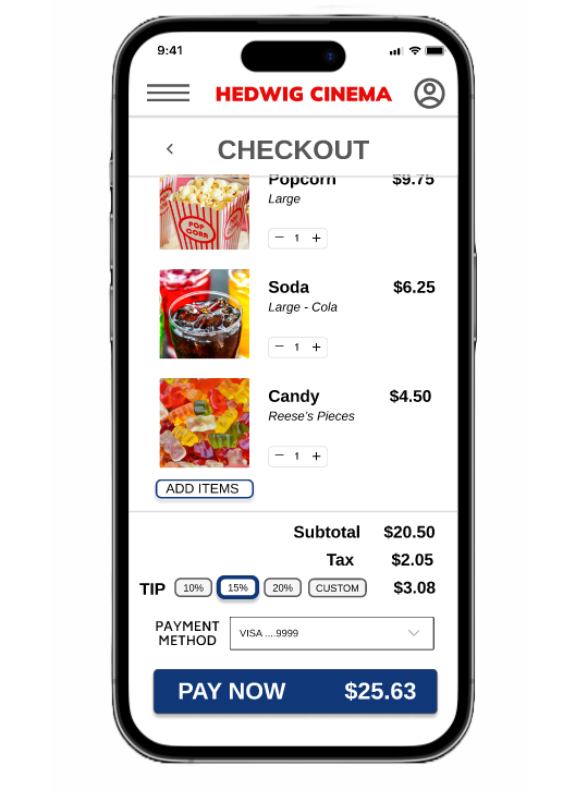
The order status screen provides key information at a quick glance. Users can see an estimated delivery time as well as a summary of their order.
The low-fidelity prototype connects the primary user flow for ordering food. The prototype was utilized to support usability studies to garner user feedback.

View Hedwig Cinema's low-fidelity prototype.
To validate and improve the design, I conducted two rounds of usability studies. The initial study utilized a low-fidelity prototype to inform the user flow, while the second study incorporated a high-fidelity prototype, providing valuable insights on areas of the mockups that required refinement.
The second round of usability testing revealed user frustration in locating the "Classic Concessions" section within the food menu. To address this feedback, I made important adjustments to improve the user experience. Specifically, I moved the "Classic Concessions" section to the top of the screen for better visibility and introduced a dropdown menu that provided direct links to each food category. These modifications aimed to streamline the navigation process, ensuring users could easily access the desired section within the food menu.


The reconfigured and redesigned high-fidelity prototype introduces a significantly improved flow for ordering snacks, offering users a more streamlined experience. Additionally, the prototype incorporates multiple navigation options, providing users with enhanced flexibility in accessing different screens throughout the app. These enhancements were made with the aim of optimizing the user journey and ensuring a seamless and intuitive interaction with the snack ordering feature.

View Hedwig Cinema's high-fidelity prototype.
The mobile app has been carefully designed with accessibility considerations in mind, prioritizing an inclusive user experience. High contrast between the background and text elements has been implemented to enhance accessibility for users with low vision or color blindness, ensuring that important information is easily distinguishable. To maintain clarity and ease of use, the app incorporates a clear and consistent hierarchy and layout, enabling users to navigate and comprehend the content intuitively. Key screens are differentiated from other elements, allowing for quick and efficient navigation. Typography has been optimized for accessibility, featuring large and legible font sizes and styles that enhance readability. In addition, images within the app are accompanied by descriptive text, enabling screen reader technologies to provide a comprehensive experience to users who rely on auditory cues. These accessibility considerations collectively contribute to a more inclusive and user-friendly mobile app for all users.
The next step in the design process is to conduct an additional round of usability testing to validate the reimagined designs and ensure they meet and exceed user expectations. This testing will allow for valuable feedback and insights from users, helping to identify any areas that may require further improvement or refinement. By iteratively incorporating user feedback, the final design will be fine-tuned and optimized to deliver a truly exceptional user experience.
The app's user-friendly design and streamlined ordering flow had a significant positive impact on users. They consistently found the app and ordering process to be effortless and efficient. By prioritizing simplicity, intuitiveness, and efficiency, the app effectively met user expectations and contributed to a highly satisfactory and enjoyable experience for all users. One participants stated, “I like the app’s simplicity. It works as expected and made it easy for me to order popcorn. I would definitely use this app at the movie theater.”
If you like what you see and want to work together, get in touch!
sonalpenner@gmail.com